Table of Contents
ToggleMost deck colors ideas look great when the deck floor is clean, dry, and freshly staged. The real test starts a few weeks later, when dust, pollen, rain marks, and everyday use change how the deck surface actually looks.
At Deck Guardian, color is never treated as a purely visual choice. We look at it as part of how the deck performs over time, how the outdoor living space feels in daily use, how the broader outdoor living area functions, and how the surface handles dirt after the first clean week is over. A deck that still looks clean after a season of use usually comes from a color scheme chosen for real conditions, not just inspiration photos.
Why Outdoor Living Space Conditions Change How Deck Colors Work
A deck is exposed to weather, foot traffic, furniture, and seasonal change, so color has to be judged with outdoor use in mind.1 What looks balanced in a showroom can shift once direct sun, shade, and surrounding elements change how different hues read outside.
Dirt, pollen, and water settle in patterns, collect along edges, and show differently depending on the deck board colors. Lighter tones can highlight stains. Very dark tones can show dust faster, while darker deck boards may still help where traffic is heavier.
Effective deck design starts with how the outdoor space will be used. A high-traffic deck connected to an outdoor kitchen will age differently than a quiet seating area, and the color scheme needs to account for that.
Two-Tone Deck Color Scheme as a Practical, Not Just Visual, Choice
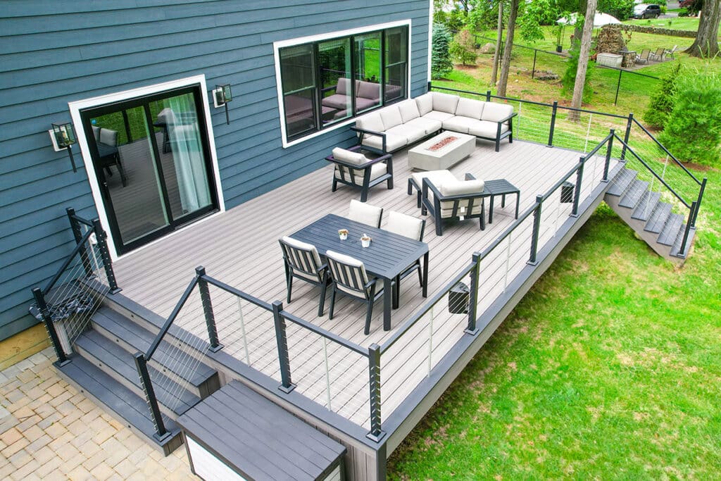
A two-tone deck can help manage the difference between high-wear areas and sections that set the tone for the whole space.
Darker colors work well along stairs, borders, railings, and frequent walking routes because they conceal dirt and use marks more easily. A solid stain on vertical elements can also open up a wider range of color options than semi-transparent stains, which usually stay closer to natural tones. A lighter main deck color keeps the space brighter, while the darker color works as a practical accent color. This approach creates a two-tone deck color that balances appearance and function.
When done correctly, a two-tone deck feels intentional. Homeowners comparing two color deck ideas should look beyond contrast alone, because a two-tone color scheme needs to follow how people move through the space and give the entire deck a stronger sense of order.
Picture Frame Border Ideas and Where They Actually Help
A picture frame border is a simple way to apply a two-tone deck approach without making the layout feel overdesigned. A contrasting border gives the deck a clearer shape, adds visual interest, and creates striking contrast without relying on too many different colors.
Framing a lighter deck field with a darker tone creates sharp contrast, defines a natural focal point, and helps mask dirt in the areas where people step most often.
The tricky part is scale. A wide border can quickly become the loudest part of the deck and create an eye-catching effect for the wrong reasons. A thin or overly subtle border may not carry enough visual weight. Done well, the border gives the space definition in a subtle way without competing with the boards inside it.
Semi-Solid Deck Stain vs. Semi-Transparent Colors: What Holds Up Better
Choosing between semi-solid and semi-transparent stain colors changes how the deck ages and how homeowners should compare color options across stain lines.
A semi-transparent stain keeps the finish lighter and more natural-looking, allowing more wood grain to show through. That can work well on a properly prepared deck where natural beauty matters more than full coverage. If homeowners are comparing Behr products or similar stain options, the same rule applies: lighter, more transparent finishes usually show more of the wood and more of the wear.
Semi-solid stain gives the surface more coverage, hides board inconsistencies, and helps create a cleaner, more uniform appearance.
Neither is universally better. The choice depends on natural wood character versus visual consistency.
Different stain and decking options respond differently to sun, rain, foot traffic, and seasonal wear. The numbers below show why color choice should be tied to surface type, not just appearance.
| Option | Key number | What it means for deck color planning |
| Solid color waterproofing stain | Up to 10 years on decks | Solid stain can offer longer coverage on deck surfaces, but horizontal wear still depends on prep, traffic, and maintenance. |
| Solid color waterproofing stain on vertical surfaces | Up to 25 years on fences and siding | Vertical surfaces such as railings, spindles, and siding-style details often hold solid color better than walking surfaces. |
| Solid stain color range | More than 1,600 custom colors | Solid stains give homeowners far more color flexibility than transparent or semi-transparent finishes. |
| Semi-transparent deck stain | Up to 3 years | Semi-transparent stain keeps more wood grain visible, but usually needs more frequent maintenance than heavier-coverage options. |
| Cooling solid deck stain technology | Up to 20°F cooler | Heat-conscious colors can matter on sunny deck boards, especially where bare feet, pets, or seating zones are common. |
| Cool Feel™ solid stain palette | 20 colors | Cooler-color options may be useful when homeowners want darker or richer tones without as much heat buildup. |
| Composite decking color families | 4 color families | Composite decking colors are easier to compare when grouped into broad families such as browns, grays, neutrals, and reds.2 |
Composite Deck Color vs Natural Wood Behavior
A composite deck and natural wood handle color in two different types of ways: one is more controlled and manufactured, while the other depends more on grain, stain, exposure, and maintenance.
Composite boards usually hold their color more predictably than wood because they are designed to resist fading, staining, and moisture damage. For homeowners who want a cleaner long-term look with less upkeep, that consistency matters.
Wood offers natural variation and warmth that composite cannot fully copy. Still, the finish has to be protected, or the deck can start showing uneven color changes.
This is why reviewing composite decking color options early in the process can help set expectations for how the deck will look, not just at installation, but after seasons of use.
How Color Scheme Should Match the Home’s Exterior
A deck is only one part of the exterior picture. It sits beside the home’s siding, trim, brick, fencing, and surrounding outdoor elements, so its color needs to work within the home’s exterior as a whole. If the deck competes with the house or nearby features, the whole space can feel disconnected.
A good deck color often complements the house rather than matching it exactly. Warm brown tones can support traditional exterior materials, while gray tones may be a better fit for homes with a cleaner, more modern look.
Bright white accents can guide the final impression. A white railing, white trim, and lighter details can break up darker boards and create useful contrast, helping the deck and outdoor living space feel more cohesive.
Tone Deck Color Schemes That Hide Wear Better
Not every two-tone deck color scheme works well after daily use begins.
Mid-range colors tend to age more gracefully. Very dark surfaces show dust quickly, while very light ones make stains and dirt more noticeable. A warm brown or soft gray usually gives the deck a steadier neutral backdrop that hides normal wear and lets furniture, railings, and landscape stand out.
Using two tones can refine that effect. A darker shade along stairs can hide heavier wear, while a border can create sharp contrast without making the layout feel busy. A lighter main deck surface keeps the space open and comfortable.
The goal is not to remove contrast. It is to manage it so the deck still looks good after regular use.
Railings, Lighting, and Color Interaction
Deck color goes beyond the surface boards. Railings, lighting, and exterior details all influence the final impression, which is why deck rail design should be planned alongside board color rather than treated as a separate finish choice.
A two-tone railing can make the deck color scheme feel more deliberate. If the tones complement the boards, the railing becomes part of the design instead of an unrelated feature. White railings can brighten the space, while darker railings visually anchor it and add depth.
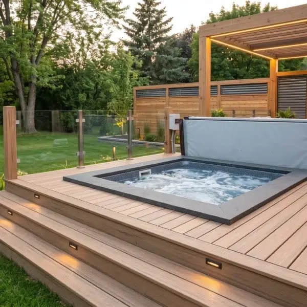
Lighting changes the final look. Warm lights bring out the richer side of brown decking, while cooler lights can alter gray tones on larger surfaces. Built-in lighting along railings or steps can add depth, improve everyday use, and create visual interest without clutter. A tiki torch can add atmosphere in some yards, but built-in lighting usually looks cleaner on a finished deck.
At Deck Guardian, we plan color, layout, and lighting as one connected system. The most cohesive decks are planned around how color, lighting, and materials interact, which is a great example of why practical planning matters more than artistic expression alone.
New Deck vs Existing Deck: Color Flexibility
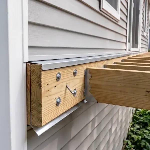
A new deck offers more flexibility. The entire color scheme can be planned from the beginning, including deck board colors, railings, and complementary colors that help the deck blend with the home. Structural details still need to come first, because unresolved deck beam span problems can limit layout choices before color is even part of the discussion.
An existing deck is more limited because the structure, layout, and surrounding elements may already define the color direction. That does not eliminate options, but it does require a more careful approach.
For homeowners exploring updates, understanding what affects deck costs in New Jersey can help set expectations. Material choices, color decisions, and surface preparation all influence the overall project.
Outdoor Kitchen Zones and Deck Board Colors
Areas near an outdoor kitchen or heavy seating zones show wear faster. Grease, spills, and foot traffic change how the deck surface looks, so these zones should be considered early when homeowners choose colors for daily use.
Using a slightly darker tone in those areas can help the deck look cleaner. It does not require a dramatic color change or a switch to one color across the whole surface. Even a subtle shift can make the layout more practical and add visual interest.
That is why two-tone deck color schemes work well: different parts of the deck can handle different types of use without making the design feel disconnected.
Creating a Cohesive Deck Design Across the Entire Space
The best deck color schemes create a cohesive look. A deck can use several tones and still feel unified if the colors work as one system, with enough visual interest to avoid a flat, unfinished feel.
That usually comes down to repetition and balance. Railings, stairs, borders, and deck boards should share a visual relationship, creating a unique look that still feels controlled.
Designs often fall short when there are too many competing colors. Keeping the palette simple makes the whole design feel stronger, especially when the same shade or related hues repeat across railings, stairs, and borders.
More Inspiration That Works in Real Conditions
Many deck color ideas come from ideal conditions: clean boards, perfect lighting, and no signs of use. Real decks do not stay that way, so useful design ideas still need to work after rain, pollen, traffic, and shade change the surface.
A better source of more inspiration is a project that still looks good after time has passed: colors that hold up, surfaces that age evenly, and layouts that make sense after months of use. These examples answer questions about which hues hide wear, which railings feel heavy, and which combinations stay balanced.
For homeowners exploring updates beyond the deck, front porch remodeling ideas in New Jersey can also provide direction on how color and materials work together across different parts of the home.
At Deck Guardian, we do not treat deck color as a final decorative step. We treat it as part of the whole build: material choice, traffic flow, railings, lighting, and long-term maintenance. The goal is to create a deck that still feels right after real life sets in.
FAQ
What deck color hides dirt best?
A mid-tone color is usually the most forgiving. Warm brown and soft gray hide everyday dirt better than very pale or very dark surfaces.
Are two-tone decks a good idea?
Yes. A darker border or accent can add definition and help busier areas hide visible wear.
Is composite or wood better for long-term color?
Composite decking generally keeps a more consistent color. Wood offers character but needs regular care.
What is the difference between semi-solid and semi-transparent stain?
Semi-transparent stain shows more grain. Semi-solid stain covers more wood and gives the deck a more even appearance.
Can deck color make maintenance easier or harder?
Yes. Some colors hide dirt, while others make dust, stains, and scuffs more obvious.
How should a deck color match the house?
It should feel connected to the house without copying it. The best choice works with the siding, trim, roof, and surrounding outdoor space.
Can deck color be changed later?
Yes, mainly with wood decks. The surface may need cleaning, sanding, or stripping first.
Does lighting change how deck color looks?
Yes. Evening lighting can make browns feel warmer and change how grays read.